Don’t lose sales from these 5 stupid mistakes!
Some of the most simple mistakes will undoubtedly lose your website sales. What’s most unfortunate about these mistakes, is that you probably had a guaranteed sale until you irritated or scared your customer enough for them to find another store to shop at.
Mistake 1 (Old dates and information):
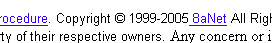
The internet is a very dynamic machine. When a visitor shows up on your website and sees your copyright date “Copyright © Anything < This Year” it instantly brings up questions. Are these prices still correct? Is this company even in business?
Unless your website has an enormous amount of perceived trust and you have a very strong brand (in which case your copyright date would most definitely be current), you will undoubtedly lose sales from this date alone.
The same thing goes for about us pages, and other information pages that can be date specific. If your about us page states that you specialize in computers with Windows 98, and Windows 2000 while Windows Vista is the current release, it brings up questions to which there is no good answer.
Mistake 2 (SSL related error messages):
I come across sites on a daily basis that serve up secure pages with some problem in their SSL configuration. When you send a visitor to a SSL protected page, there is a good reason for it. And, when an error message precedes that secure connection, all confidence in your security is lost. If you can’t figure out how to properly encrypt a website / page / sub-domain without errors, you need to hire someone who can.
Does this make you want to continue checking out?
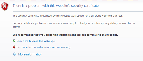
Also, to help prevent this from ever happening, make sure you do not permanently install mis-configured ssl certificates. If you do get a ssl error, make sure not to click the permanently allow this connection option.
Mistake 3 (Not showing payment and shipping options immediately):
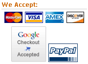
You should display your accepted payment methods on every page of your website! Don’t make your customer click on the about us, faq, or any other link to get this information. I’ve got securely hosted credit card logos here, if you need them.
You should display the shipping options and prices as soon as technically possible, on the shopping cart page is best! Also, do not make your user enter all of their shipping or billing information, (or worse yet, make them register) before you give them shipping prices. Much of the time, your customer won’t even consider filling out that much information just to get an idea of how much shipping will cost.
Use a single zip field to calculate shipping and ask for the rest of their information further in the checkout process.
Mistake 4 (Improper add-to-cart functions):
With the Web 2.0 craze going on, it’s common to see spiffy Ajax and dynamic add to cart functions where some small area of the website is updated when an item is added to a shopping cart. This is not only a bad idea, but it can be usability suicide.
While these actions may seem obvious to you, a lot of users don’t notice a small box being updated, and it’s rarely what a shopper is expecting to happen. It’s always best to redirect your user to a shopping cart each time they add something to it. You can then provide a return to last item / category / brand or whatever else link from the shopping cart page as needed.
Mistake 5 (Poor internal search):
Google became popular because their search results were quick, and highly relevant. Search function on your website is extremely important, and should be quick and relevant. You need to be able to account for things like misspellings and incomplete words. If you don’t have the ability to implement a solid search function yourself, you should look for a 3rd party application to use. If your website is well indexed, Google offers a custom search engine that you can integrate into your website.
The only thing worse than showing bad search results is showing none at all.
Subscribe to the RSS feed and have all new posts delivered straight to you.
Hi all,
Very good information. Thank You Jestep.
I think mistake #4 should be given a high priority. Do retailers make this mistake? Thanks again for mentioning it.
In addition to this i like to add few other mistakes that can definitely lower conversion rates.
No customer Support Service
Addition of unknown products in the shopping cart
Expensive Delivery costs. Retailers can experiment with lower shipping costs or free shipping over certain price reach.
Long checkout process .
As an online retailer you have to make sure that you don’t follow these mistakes.
I strongly recommend you to read 12 ways to Win Over Online Shopper.
http://www.retail-ecommerce.com/2008/05/12-ways-to-win-over-your-online-shopper.html
That was a well compiled list of mistakes 🙂 Sure it’ll prove very useful to corporate websites.
A good list of points. On our site we changed from an inhouse search to the google paid for search service. We immediatly saw more relevant terms being found and a increase in sales.
Regarding payment methods, we recently added a paypal option and was surprised to see an immediate take up of the option.
Great list you have here.
Very useful information for ecommerce site.
I also agree with Idris that the checkout process should be short.
Hi Jestep
I recently got a traffic ticket and was required to take up a defensive driving course in California. I would like to shate my experience with you. I surfed through several websites, and finally subscribed with I Drive Safely (www.idrivesafely.com/California). In the process, I discovered following mistakes made by most of the websites.
Blunder #10: No “About Us†page or privacy policy
There were no privacy policies, disclaimer, or about us page. It made be skeptical that this company is for real.
Blunder #9: Where is the price?
I could not find price on most of these websites. I had to literally hunt around to find the actual price.
Although from a web designer perspective, this may be a good “featureâ€, it will only take a genius to figure out that they have google through rocket science before the price will magically appear on site.
Blunder #8: Design for the 20%
Most of the companies forget Pareto 80-20 principle, and design the website to account for all exceptional cases. I left many of the traffic school websites because of the time taken, and complexities involved in checking out.
Blunder #7: Weak Security
After going through all kinds of messages and disclaimers about how they valued their customer’s security, I completed the registration form in some of the websites. My confidence in that website disappeared when I saw the final thank you page. It said “Thank you for registering, please note your user ID and password for your recordsâ€. There it was – my password in pure plain text staring at me, on a non secure thank you page! I was enough for me to abandon my transaction.
Blunder #6: Excessive Mandatory Fields
Excessive mandatory field/ registration form in the middle of check out page is like adding speed bumps to a 60mph highway. It was one of the reason for me to abandon my registration in some of the websites.
Blunder #5: Clearing all the fields in case of an error
Many websites gave a clear registration form when entering any wrong mandatory filed. Unacceptable.
Blunder #4: Forcing customers to create an account before they can add items to cart
In the hope to register as many users as possible, some sites asked to sign in or register as soon i decided to purchase. It forced me to abandon the registration process.
In the light of these, the perfect site i came across was http://www.idrivesafely.com when registering to California Traffic School at http://www.idrivesafely.com/California
Good points, I am setting up my own ecommerce store http://www.himitsu-bako.co.uk which is a sight dedicated to traditional style puzzles.
Having read your post I went back through the sight and made a couple of changes. Thanks for the info, you know sometimes you cannot see for looking lol.
thanx, rather interesting
> Design for the 20%
I agree, the design is not so important as “message”
thank you Jestep for most useful mistakes that enroll in every marketing area. Practically these are the most 5 common valuable mistakes that we can see. thanks for information and hopefully more people can learn from this post…!
Hehehe definetly agree with mistake number 1. Old dates and information, today i almost had this kind of experience with some muffins i bought.
Also i never thought how important is to put in the right time all the payment systems for paying online.. now im aware of it, thanks.
Very informative really interesting. And i had a doubt about having a payment option on the home page . while we placing a payment option on home page are we going to loose any conversion . I my view we can improve more conversion. And any suggestions on this please let the users and me know about this