Archive for the ‘Usability’ Category
REI breaks the back button
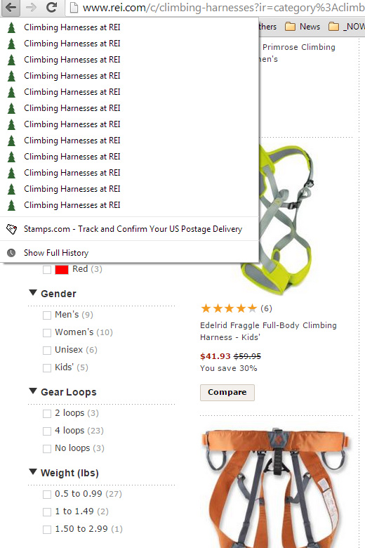
Been a while but I came across a usability blunder bad enough I had to share it. REI uses some javascript to do some whacky stuff to the browser history. It’s so bad that on some pages of the site, there were over 30 entries before I could back up to the page I was previously at, and this is without taking any action on the page except moving the mouse. I checked a number of product and category pages and all had similar coding problems.
Quick screenshot, 1 of 3 pages of history of the same page:
This just defies all logic. I can’t believe anyone let this malignant code hit a production website, especially one the size of REI.
REI, you’re doing it completely wrong.
How not to decline a transaction – ebay and paypal 2013
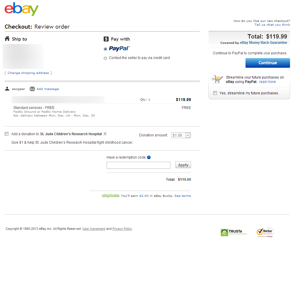
I was amazed today trying to checkout on ebay that ebay and Paypal still haven’t figured out how the transaction flow is supposed to work. If a paypal transaction declines when checking out on ebay, rather than giving an error like reason would suggest, they just dump you on a login page. Yes folks, a login page. I’m more or less laughing at this instead of being upset because it’s so absurd that I can hardly believe it myself.
I repeated the process 3 times just to rule out user error and took some screen shots for entertainment.
The ebay checkout page:
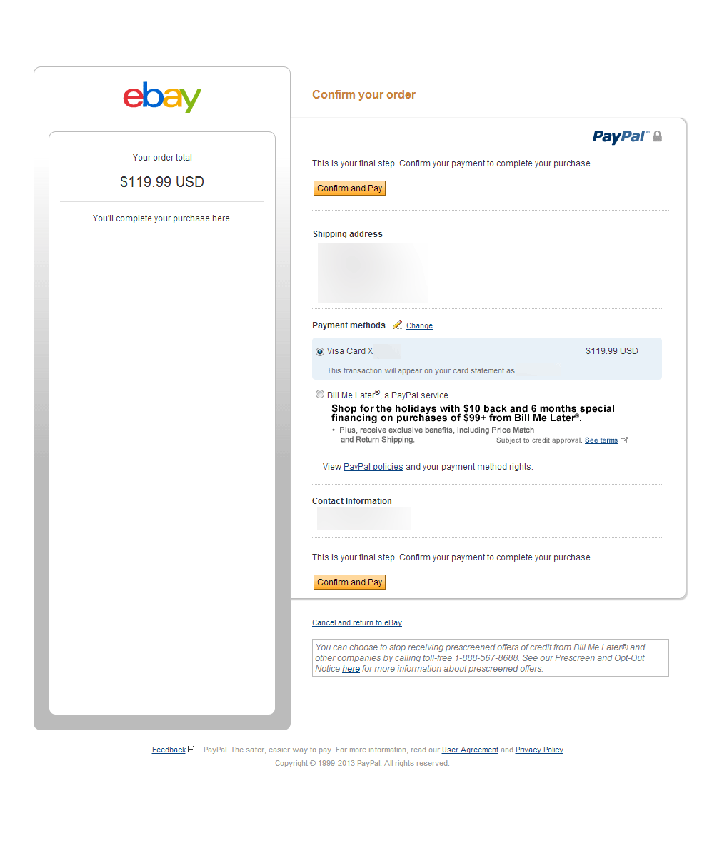
The payment page:
The decline page:
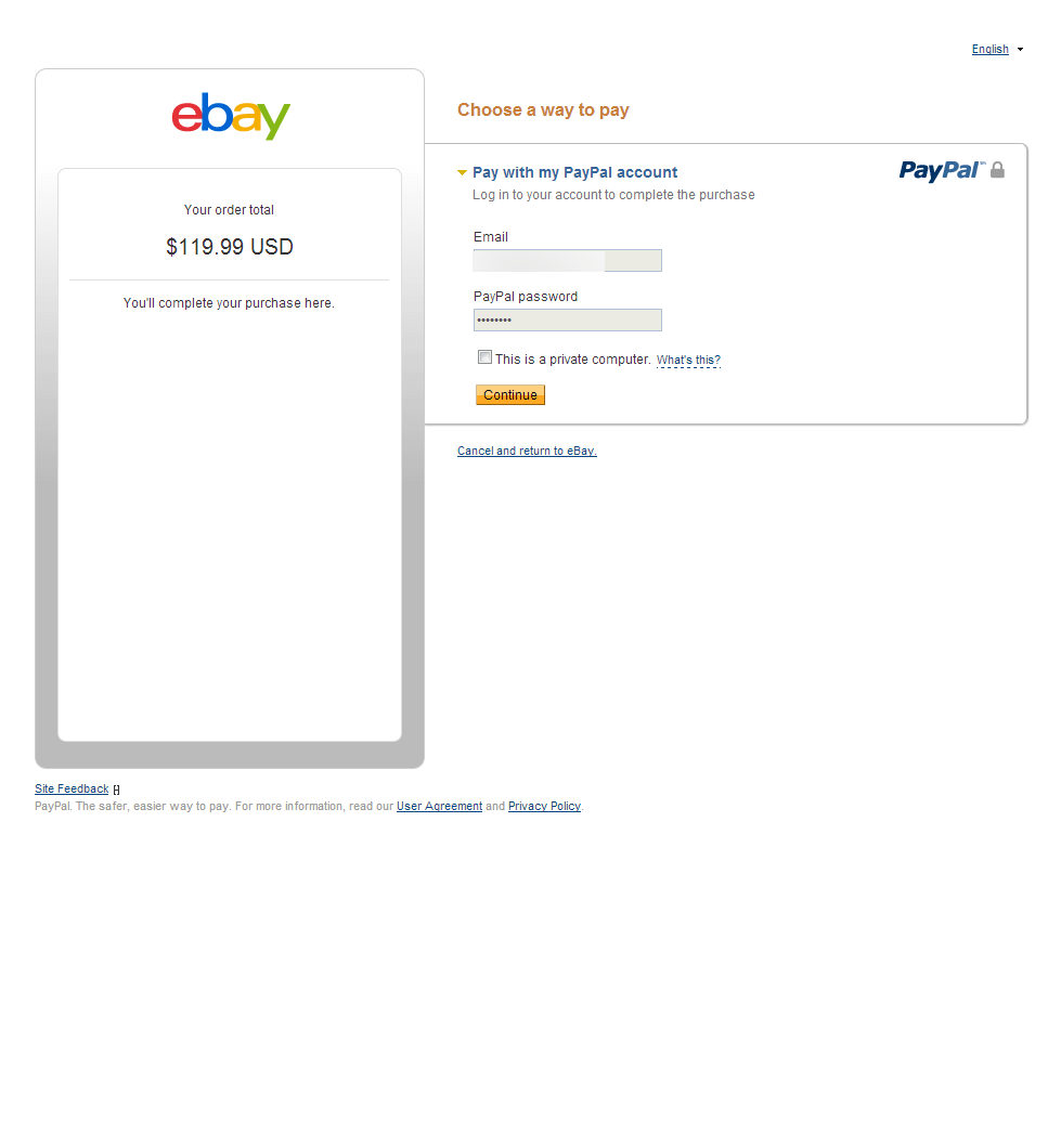
I was only able to figure out this was a decline when I logged in again, and then finally there was a cryptic message about the card being declined. After trying a second card and inevitably going through a loop of declines I eventually gave up on trying to make payment.
Anyway, this is a good example of what not to imitate. It should be pretty embarrassing for both ebay and Paypal considering they are considered founders in ecommerce and online payments. Happy holiday!
The un-usability of online video
Just about every news website and blog uses online video as a means of communicating with their audience. Online video started gaining popularity several years ago with the creation of youtube and other video sharing services. Youtube gained immediate and nearly unprecedented popularity. Media companies looked at this inspiring boost in traffic and had to figure out a way to monetize online video.
Putting history aside, online video is often used improperly. Companies are hanging on some antiquated TV theory that people want everything delivered in video and not in text. I’ve gotten to the point where I won’t even watch a video article online.
The biggest problem people make, is using an unextraordinary video as a destination rather than additional media or commentary that accompanies an article or other piece of information. I can’t even tell you how annoying it is to click on a news article and have it be a video instead of text. What’s even more annoying is that whole “monetize” concept. I not only cannot read the article I wanted to read, but I have to wait 30 second to see a video which i didn’t want in the first place. Using video just for the purpose of using video is just crazy. I don’t need to see some newscaster or blogger reading something to me that would have takes 2 minutes myself and would have been more clear and scan-able. I will say that online retailers have much better grasped the concept of appropriate video usage, as they often supplement their products with video demos or other informative casts.
In all, if the video is the point of interest, such as a show (in whole or part), a movie, or something that cannot be better represented in text then it’s probably appropriate. If the video is simply a person reading an article, or newscast, or anything that could more easily be explained in text, use text! The same concepts can be applied to slide-shows, flash, and just about any other dynamic content we find on the internet. Don’t use media as a destination just for the sake of using it.
The one caveat to this argument is mobile content. Since it’s often difficult to read lengthy content on a phone, a video may be more than appropriate. However, this doesn’t mean that video should be the only medium that the content is available in. At the very least, put an entire text version with any diagrams or pictures if appropriate below the video so the rest of us on normal computers can “read” it.
Payment method and credit card logo API
I just finished a simple credit card logo API which is outlined on my other blog.
This offers an easy method of adding credit card logos to an ecommerce website. We designed some very clean icons for each logo. The API supports 2 sizes currently, fully dynamic sizing and margins are planned for the next update. It also supports specifying background colors.
Here’s a few examples of logos generated using the API.
Using: https://www.merchantequip.com/image/?bgcolor=000&logos=p|g|bml&height=75

Using: https://www.merchantequip.com/image/?bgcolor=fff&logos=v|m|a|d|jcb|dc&height=75

Using: https://www.merchantequip.com/image/?bgcolor=fff&logos=v|m|a|d|jcb|dc&height=35

The order and the exact logos can be specified through the image url string. The logos currently come in 2 sizes 32px and 64px, but as stated, fully dynamic sizing will be available shortly. Logos through the API are all delivered securely to prevent SSL related errors. We also made a simple credit card logo generator for those who don’t want to mess with an API.
Here’s all available logos:


Best shipping practices for ecommerce websites
I think that shipping is one of the most difficult aspects of running an ecommerce site. In my experience and observations of other sites, shipping costs and delivery time-frames are the biggest customer complaint that online retailers receive, a recent study confirms shipping to be one of the most important thing to shoppers. Even if the shipping is free, customers often have obscene expectations on how fast their order will reach them. If it’s not free, there are always complaints about the cost even when the merchant directly passes down fees with no markup.
This is my guide on presenting, charging, and handling shipping services and fees for small online retailers.
- Have a shipping policy section on your website.
- Show shipping options, prices, and delivery time-frames.
- Be very cautious about offering free shipping.
- Don’t use USPS.
- Ship Now!
- Keep your customer informed.
Have a shipping policy section on your website.
 When your customers know what to expect, they are less likely to be upset when you do exactly what you said you would. No matter what your company’s policies are on shipping, even if they are simply rotten, make sure that they are clearly posted on your site. Make sure that you do better than any policy on your site, shipping or otherwise. A shipping policy or refund policy should be a fallback point, not a guideline. If you say we ship within 48 hours, ship today.
Show shipping options, prices, and delivery time-frames.
On the shopping cart page, make sure you show available shipping options with their price and the estimated delivery time-frame. This does not mean, make your customer register or fill out their shipping address or fill out anything at all, before you show them shipping options. Ask for their zip code only (Not their zip and state, you can figure this out yourself) if your prices vary based on the delivery location.
I find that the best way to visually present shipping options is a list with a radio button for them to select their desired method. This is better than a drop-down box because it is easier to see and compare all of the options, and doesn’t require any clicking. Make sure to preselect the cheapest or the best value shipping method for them. This way they don’t have to interact at all if that’s what they choose.

If you use UPS or Fedex they offer tools to help you determine the delivery time-frame. Make sure to have your programmer use logic if you ship tomorrow, or need an extra day for packing, or your customer places an order on Sunday, a Holiday, etc. The delivery time-frame should be as accurate as possible. But when in doubt, add an extra day for padding. It’s perfectly fine to deliver early, but is never acceptable to deliver past the date you said you would.
Be very cautious about offering free shipping.
Free shipping is great. It can drive sales and give a company a huge competitive advantage. I’ve experimented on ebay many times with offering the same product at different prices and different shipping prices. Free shipping is a large enough incentive that many people will chose a more expensive overall price, over an item with high shipping costs. Shipping costs make people feel like they are being gouged, so there’s psychological motivation when shipping is very cheap or free.
However, free shipping is not great when you need to cancel it. If you have an established website, canceling free shipping can literally kill the business. Especially in the case of repeat customers, you can lose a lot of business when you revert back to a paid shipping format. This even applies to limited time free shipping promos.
A good alternative to free shipping, is free shipping based on price thresholds. This can also backfire though, as online retailers often make the same profit (not margin) on expensive products as cheap ones. If your products get heavier as they get more expensive, you can end up cannibalizing all profit if you offer free shipping in situations like this. You need to do the math for your products and your shipping fees, but make sure you aren’t destroying your profit by offering this.
In any case, be very careful if you decide to offer free shipping, or threshold free shipping, even as a promotion. The backlash when you retract it, if you can retract it, can be severe, and it just may not work from a shipping cost to profit perspective.
Don’t use USPS.
 USPS can be great for some product types. It is perfect for low ticket products or those that can be crammed into a pre-paid priority box or envelope. It’s also great if your customer has no expectation for the package to get there in the next week, month, ever…
If you’re like most of us, USPS is nothing but a headache.
To start off with, their package tracking is simply unacceptable. Since about 1998, customers have expected to be able to see their package progress once it is shipped. With USPS this current day, they can possibly see cryptic postdated message after it’s updated at 7 or 8PM in the evening. Did I mention that delivery confirmation, package tracking, and just about any other expected service costs extra.
Next, the package pickup services leaves something to be desired. Unless you’re shipping out a semi trailer of packages every day, you need to have the box at the pickup location or post office very early for it to go out the same day. This is completely unreasonable for most online retailers that ship their own products. To make this work, you almost have to delay all orders from shipping by a day so they can be packaged the next morning.
Third, delivery time-frames are a complete toss up. Here in Texas, I’ve seen packages take 1 day, and 5 days in the same state. There’s no reliable way to predict the delivery time-frame. Your customer asks you when the package will be delivered. Your answer of “sometime in the next 5 days” does not make people happy.
Lastly, when USPS loses a package, which happens all the time, it’s a bureaucratic mess to try and find it or get compensation for it. The time it takes to recover anything often offsets the loss of the product and the cost of sending a new one.
There’s good reason why almost every highly successful online retailer uses UPS or Fedex despite them being more expensive.
Ship Now!
Probably most important of all is just ship the damn package now! Don’t wait for 2 days to package it up, and another day to label it and another day to drop it off. Get it in a box, put a label on it and get it out the door.
If you want to be a remarkable online business, your packages must go out the day you receive the order.
I can’t count how many times I’ve ordered and finally after 5 days, I get an email that my package has been shipping. Seriously, did you have to build the manufacturing plant, required to manufacturer my product or something??? I will not buy from you again if it takes 5 days to ship unless there is some extenuating circumstance and you told me about it immediately.
The quicker you get the package out, the happier your customer will be and you no longer have anything left to perform with the order. Everybody wins when you ship quickly.
Keep your customer informed.
Through every step of the purchasing to shipping to delivery process, you should be keeping your customer informed on the status of their order. This is the one area that you have 100% control of, so there’s no reason not to do this. Send an email letting them know you received the order. Email letting them know it shipped. Email letting them know that you messed up and it’s back-ordered. Email letting them know it was delivered, and follow up in a few weeks to make sure they got it, and it is what they wanted.
This last step is extremely important for 3 reasons. First, it is a proactive approach at solving any problems your customer may be having. It tells them you care enough about their satisfaction that your reaching out to them to make sure everything is excellent. Second, it helps prevent chargebacks by reminding them that they purchased something from you (They will be receiving their statement about right now and they forgot the name of your company. Sorry, it just works this way.). Also, if there’s a problem they know to contact you and not their bank. Last, it gives you an opportunity to make another sale with your new customer. Offering coupons or other incentives is an excellent way to gain a repeat customer and this email is the perfect medium. Too often I see this used with an aggressive marketing tactic to get warranty sign-ups or other high-profit, tasteless services. Don’t forget, this email is still about them so keep it reasonable if you want them to come back.
Concluding thoughts:
No matter how awesome your business is, you will get complaints about shipping. You may not meet some-one’s expectations, you may ship a day later than they were expecting, they think you can miraculously ship or deliver on Sundays, your packages will get lost or destroyed or delivered to the wrong address. As long as you are handling shipping in the best way possible, there’s little more you can do except provide good support to your customers when something does get messed up. If you’re running a site that makes your customers register or fill out a form before getting options, or you ship 5 days after you receive an order, I can almost guarantee your sales will immediately improve once you implement some better shipping practices.
Google, give me back my “backspace”
Google’s newest instant search ajax madness has completely broken the back button. If I am on a google search result page, and I hit backspace, it instantly focuses into the search box, and deletes the last character. Even if I click on an empty area on the page, and hit back, it again focuses on the search box and deletes the last character. Huh???
I mean seriously, there are 2 buttons on the keyboard that you should never mess with. The Enter key, and the backspace!!! Take my Q or X or something, seriously. Google, wake up, this is not what you are supposed to do. You are not better than the backspace!

Framework for a Good Product Page
I was inspired by the Anatomy of a Usable Website, and decided to make a similar guide for a product page. I had previously written a post regarding product descriptions, which still apply here as well.

Download the full PDF version »
This is meant to be a framework for creating an ecommerce product page. There are of course many additional things that could be put on a product page, but these are the essentials that every page should have. The more features that a product page has, the more likely a user won’t notice them.
In the end, websites benefit from clean and well organized content.
Could your ecommerce site kill somebody
I was recently looking at Google Maps for some route information to find a driving time near my hometown in Colorado.
Google Suggested that I drive over a pass called Schofield pass. While this could be just any old pass, but it’s not.
Schofield Pass is one of the most dangerous roads in Colorado. It is a 7ft wide rocky mess of a trail with a 500ft cliff on one side and a solid rock wall on the other. It has been called the most dangerous pass in Colorado, and boasts a near-vertical 27% grade in some places. Over 20 people have perished on it in past 30 years. Just a few months ago we saw an abandoned Suburban on it, who’s owner thought it safer to forget about his vehicle than to risk the descent. Until cleaned up in the recent years, the river below was littered with the remains of Jeeps, and Trucks that didn’t make it. Oh, and going up is 100x harder than going down, which is what Google Maps was suggesting.
Here’s a Youtube Video that shows very well, just how bad Schofield Pass pass is. And yes, this is a “road” that people drive Jeeps of 4wd’s over.
So I got to thinking, how many similar passes in Colorado could Google be suggesting people to use. I found an additional 2, very dangerous passes, in about 5 minutes of looking.
Pearl Pass is the first, and Ophir Pass is the second.
Just a small section of Pearl Pass:
Ophir pass is the easiest:
Now all of these routes are in somewhat obscure locations, but the areas that surround them are visited by millions of tourists every year. It would be extremely easy for someone to pull up directions for a scenic drive on google maps, and … Someone actually tried to drive Schofield in an 18 wheeler some time ago.
So if you are a software, information, or anything else company, it may be a good idea to make sure your program isn’t gearing up to kill somebody. Based on the usage, I would bet that Google Maps has already done so somewhere!
Newegg.com’s Usability Blunder
I buy a ton of the computers and IT products for my company through newegg.com. They have always had great prices and rock solid policies.
I tried to make a purchase from them this morning, and much to my astonishment, I couldn’t log into my account. I was sent into an infinite loop between their image verification and log-in scripts. After some investigating, I concluded they are now requiring Firefox users to have network.http.sendRefererHeader set to 1. Many Firefox users, myself and every computer in my company included, set this value to zero, which prevents websites from seeing where you came from. To me this is simply a privacy concern, as it’s nobody else’s business but my own to know the last website I visited. Some anti-spyware software automatically set this value as well, so you may not even know if your is set to zero.
7. If you are using Firefox, type “about:config” in the address bar. Set the “network.http.sendRefererHeader” value to 1.
By requiring the value, newegg is completely preventing a huge number of Firefox users from using their site, and subsequently becoming customers. Not only is this unneeded and is most likely due to some corporate idiot that thinks they can add to the bottom line by tracking users better, but this is an unacceptable coding practice. They have currently lost me as a customer (I can honestly say that it is a sizable loss).
If you own an ecommerce site, don’t ever make changes and requirements that force your customers to lower their privacy standards or lower their browser security. I promise that you will lose customers as a result of making changes like this. This is completely fixable, but at the expense of your own privacy. I’m surprised that newegg would do this given that a huge number of their customers, if not the majority, are tech savvy shoppers who are likely to also block referrers.
5 Steps to a A Proper Contact Form!
I’m not sure if there is an authoritative guide on a website’s contact form, so here’s my take on the picture.
A contact form is a seemingly simple feature, that most websites mess up. While a broken or poorly designed contact form may not be the end-all problem with a website, there’s no reason that it shouldn’t work correctly.
What a contact for must contain:
- Name, email, (optional: phone), and message fields
- Shouldn’t Contain… A ridiculous captcha verification script
- Confirmation / feedback that the form was properly submitted
- An email response that the form was successfully received
- Finally… A response from someone that read the form (If necessary)